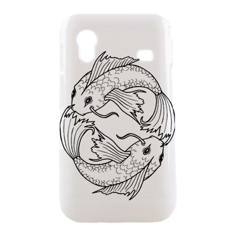
I have decided to present my logo on a phone case. This is a modern context which is very different to a display in an art gallery. I decided not to use watercolour paint to add colour because in my logo colour was not significant. It was the image itself that had meaning, and I felt that adding colour just made it too fussy.
Here is a picture of the phone case:
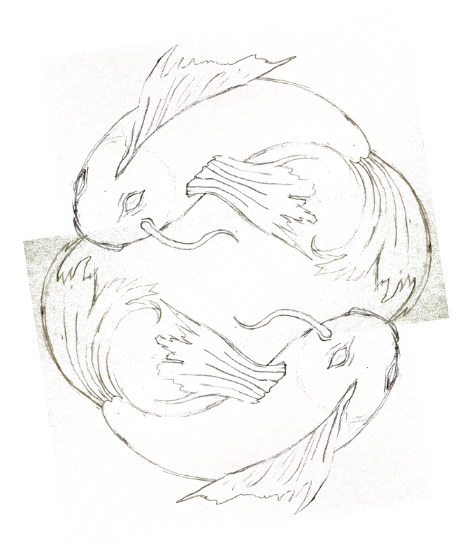
I've finished my logo and scanned it in. I am thinking about adding some colour using watercolour paint, but I think I'll just leave it as it is.
A very basic sketch of my Koi fish logo. I took a photo of my page then on the computer I duplicated it and flipped one of the Koi upside down and backwards to create my logo. The shape of this is pretty similar to how my finished logo should look.
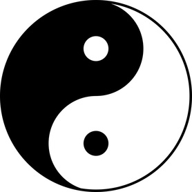
Another thing that my swimming Koi logo reminds me of is the Chinese yin and yang symbol. It is used to describe how opposite or contrary forces are interconnected and interdependent in the natural world. Examples of these forces include male and female, light and dark, high and low, hot and cold, water and fire, life and death etc.
Everything has both yin and yang aspects. Yin and yang are actually complementary, not opposing, forces which are interacting to form a whole greater than either separate part. They depend on each other; for example, a shadow cannot exist without light.
I like the way yin and yang are balanced and harmonious.
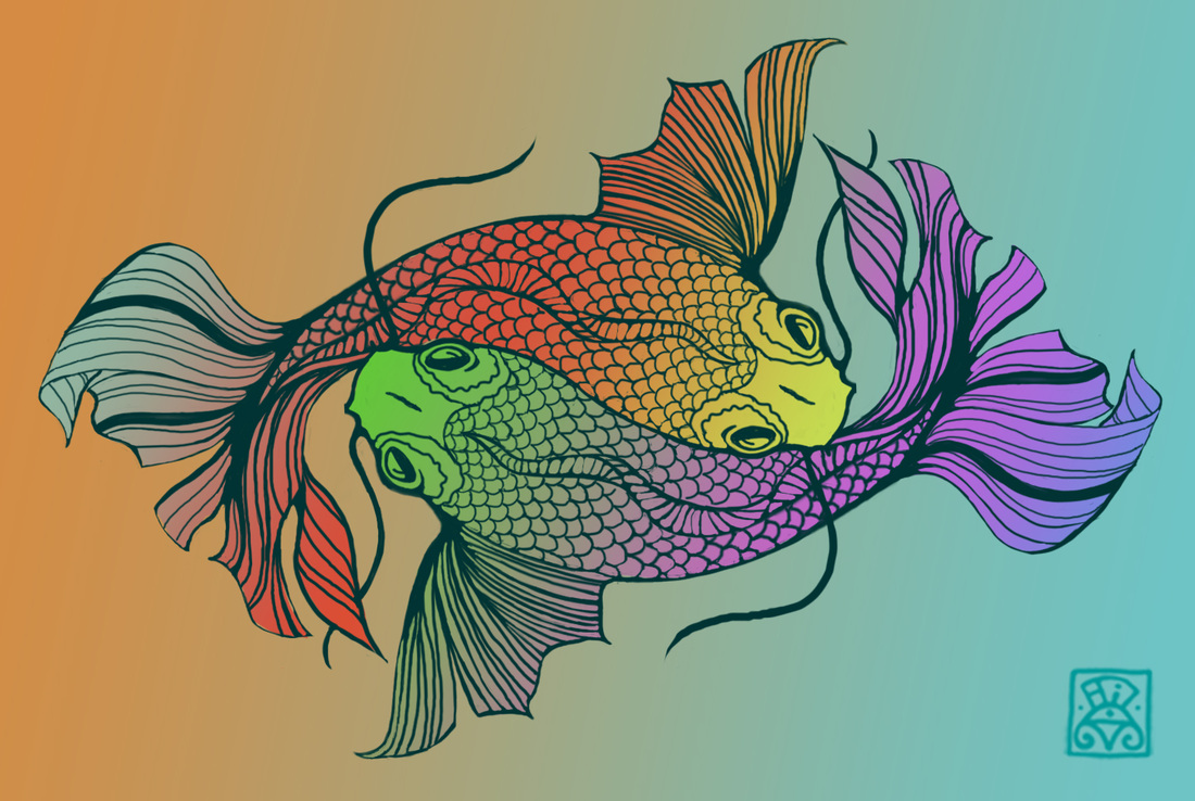
I love these artworks by Yiying Lu, particularly her clever incorporation of QR codes. I am probably not going to use a QR code in my own personal logo, but I am considering using watercolour paints.
There is an old fable that said a Koi fish could try to climb up the waterfalls at a specific point on the yellow river to become a dragon. The Koi in the story climbed up the waterfall, even though there was a strong current attempting to sweep the Koi down into the pool below. The Koi fought against the current to reach the top of the falls, showing great perseverance, because it badly wanted to achieve its goal. The Koi fish battled bravely and made it to the top of the falls, and was turned into a magnificent dragon. It was allowed to evolve into a more advanced, more vibrant creature due to its extreme perseverance and determination.
I like this fable because I agree with its message and believe that it is a very true and important one. If you persist, and work hard when trying to achieve goals in your life you will eventually be rewarded with success, and become a better person. Perseverance and dedication to my work are both very important values of mine.
It is said that the Koi fish stands for good fortune and luck and that it symbolizes a person's ability to aspire to be a better, more advanced part of the universe. It is also said that if you are someone that has high expectations for your life and high goals for success and happiness then the Koi fish is the symbol of everything for which you stand. I believe that the Koi fish is a good symbol for me.
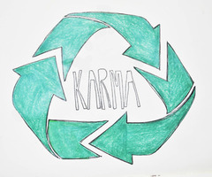
My logo isn't just a couple of fish swimming in a circle because it looks good- it also reminds me of cycles, like life cycles and karmic cycles.
What goes around comes around!
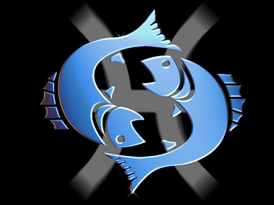
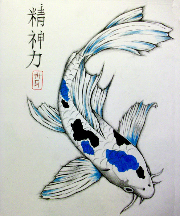
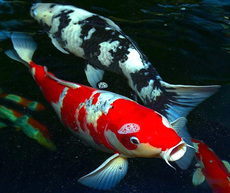
The picture on the right looks a lot like the fish in my logo- showing how karma is a cycle.
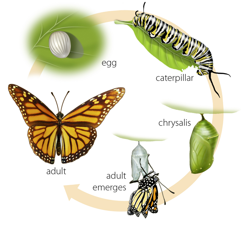
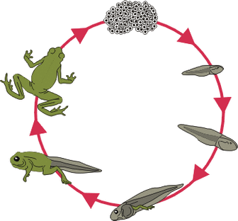
The fish circling in my logo also remind me of life cycles, like the ones above. I think that all life definitely has a cyclic nature.
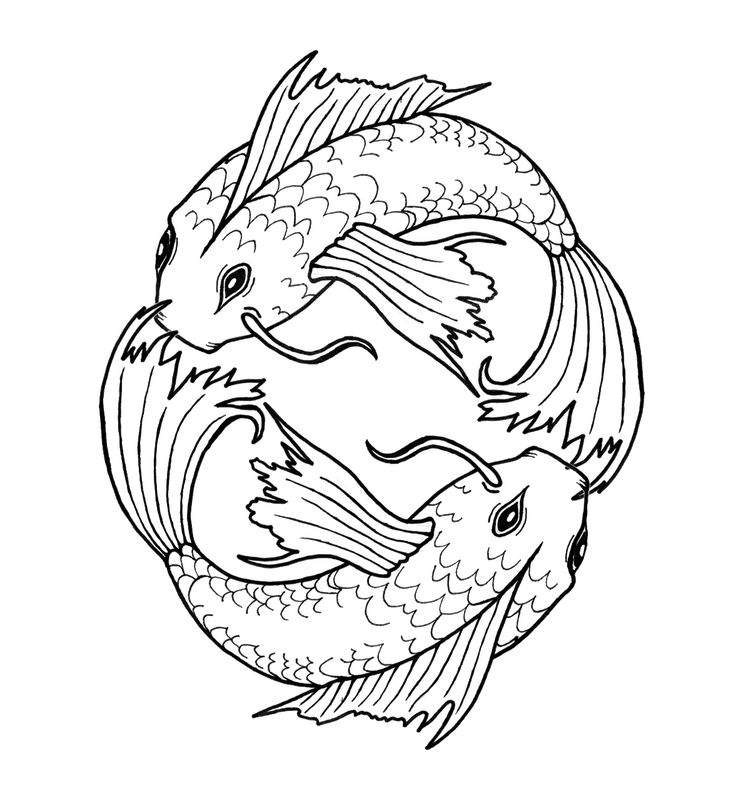
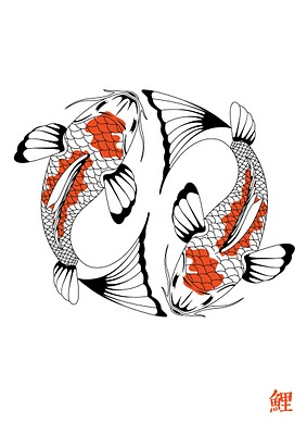
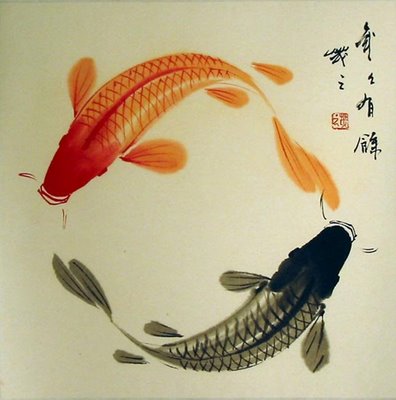
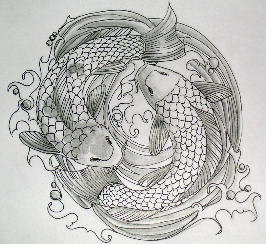
When I first decided to create a logo with Koi fish swimming in a circle this picture I found was the one that was most similar to what I had in mind for my own logo. I am planning to also draw two Koi fish in the same position; however I will not be including the Pisces sign, even though I myself am Pisces. The two fish are symbolic of Pisces by themselves and I do not want to include the sign as well.